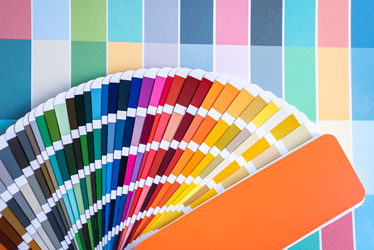
ค่าสีในงานออกแบบมีความสำคัญมากในการสื่อความหมาย และทำให้งานออกแบบนั้นกลมกลืน สื่อความรู้สึกไปในทางเดียวกัน ดังนั้นการเลือกใช้ชุดสี Color Palettes หรือชุดค่าสีสำหรับชิ้นงานเดียวกันจะยิ่งทำให้งานออกมาดูน่าสนใจและเป็นมืออาชีพ ดังนั้นในบทความนี้ผมขอแนะนำ 100 ชุดค่าสีสำหรับการออกแบบสื่อหรือจะนำมาใช้กับการออกแบบเว็บไซต์ก็ได้ครับ
ชุดสีที่ตั้งชื่อตามความรู้สึกพร้อมภาพประกอบตัวอย่างการใช้ชุดสีในชิ้นงานจาก Canva Blog ครับ
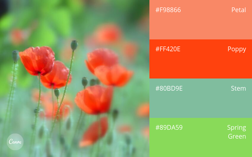
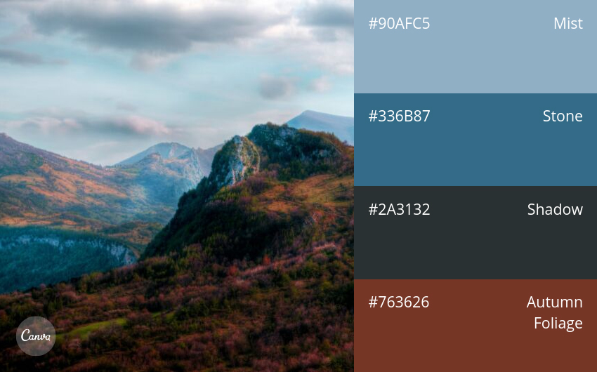
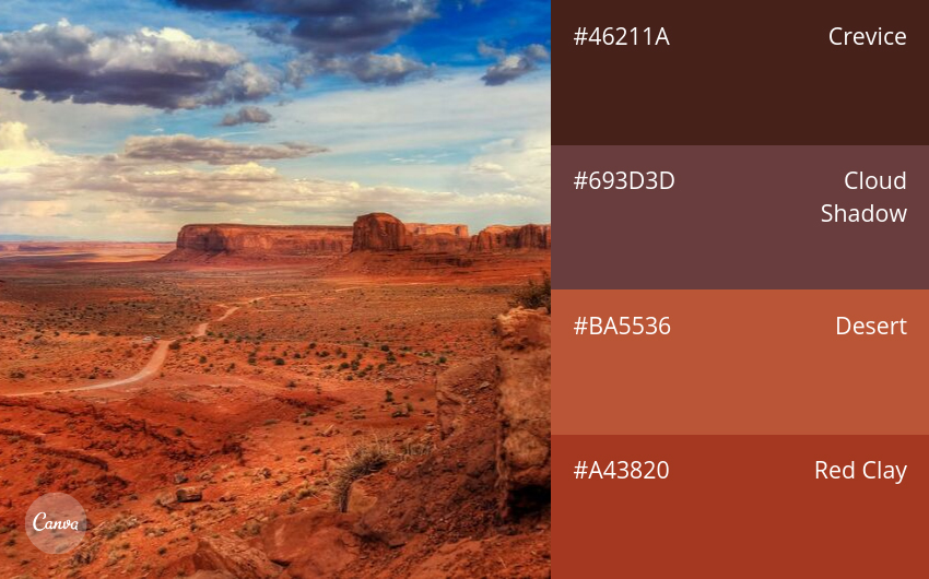
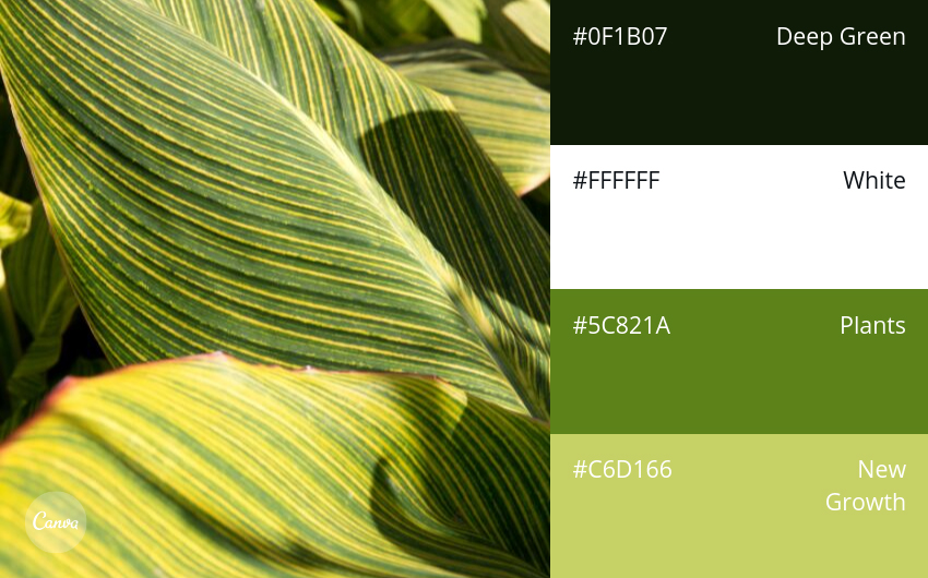
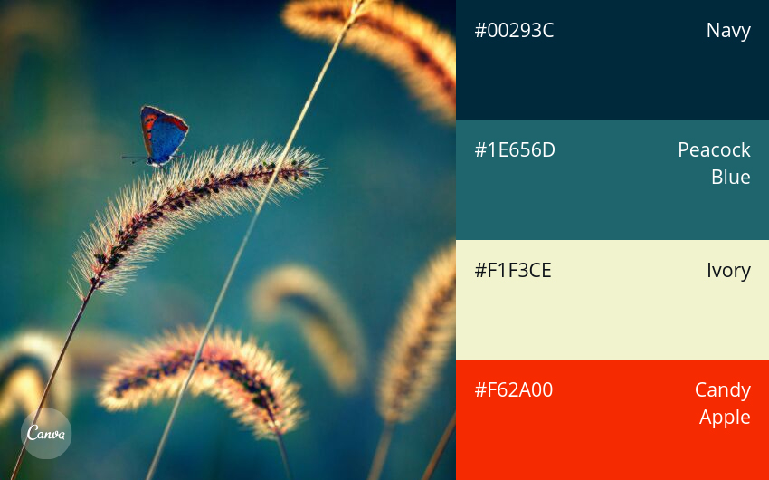
Nature
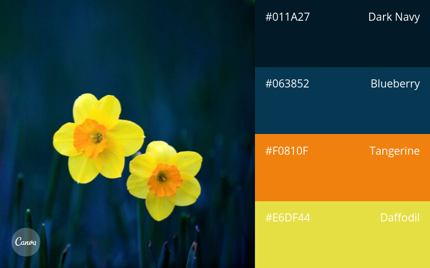
01. Fresh & Bright
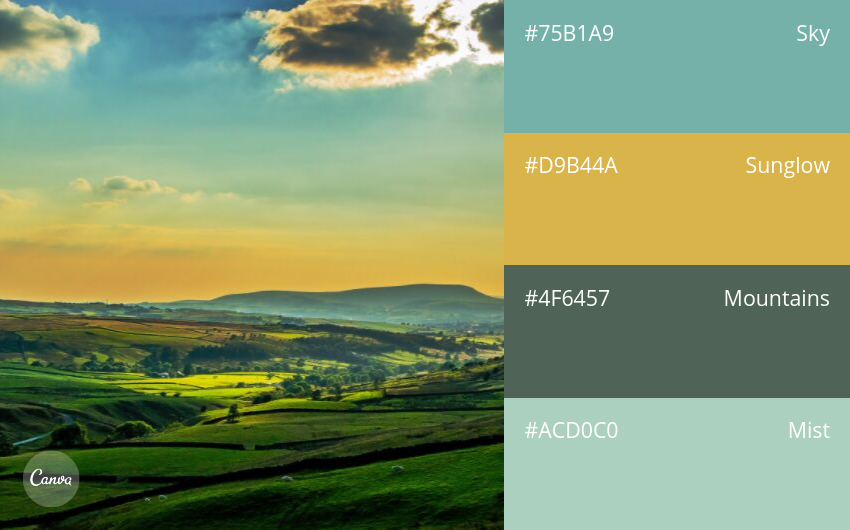
02. Subdued & Professional
03. Dark & Earthy
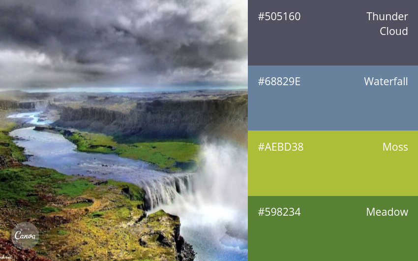
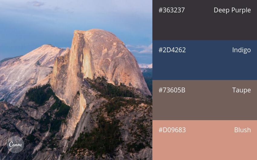
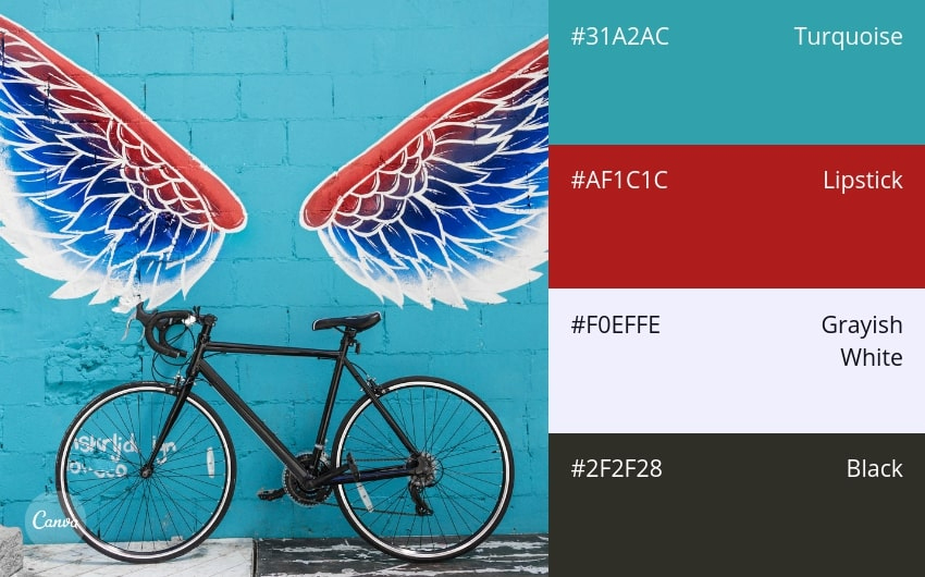
04. Crisp & Dramatic
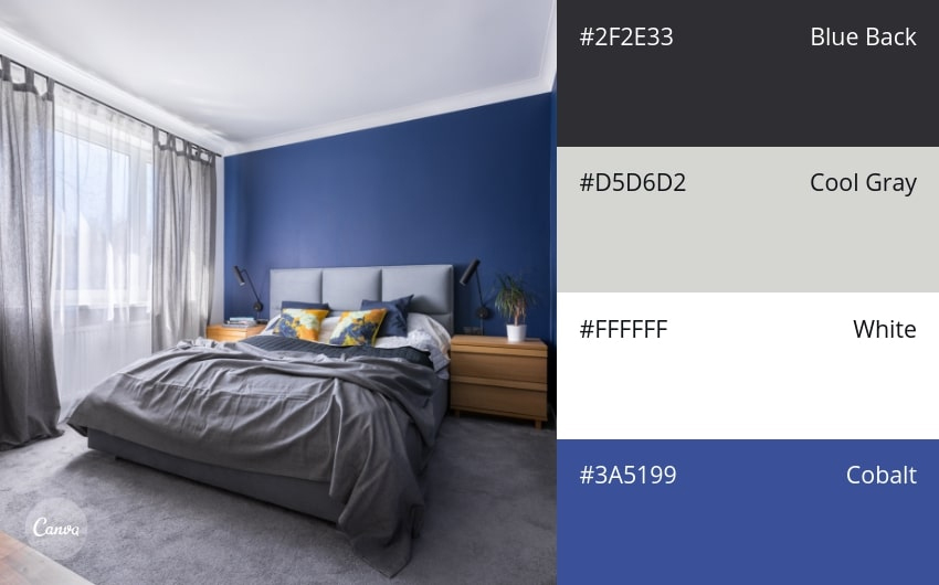
05. Cool Blues
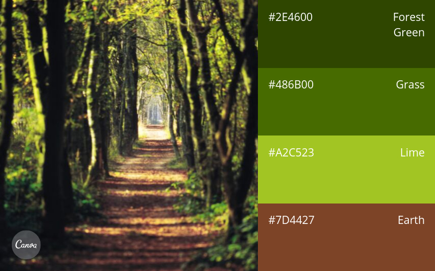
06. Outdoorsy & Natural
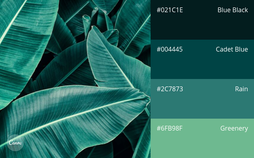
07. Watery Blue-Greens
08. Primary Colors With a Vibrant Twist
09. Refreshing & Pretty
10. Playful Greens & Blues
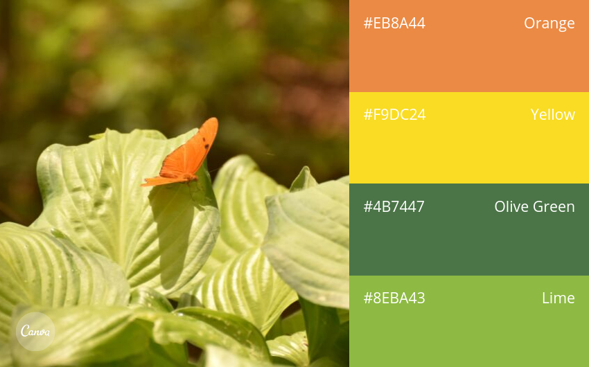
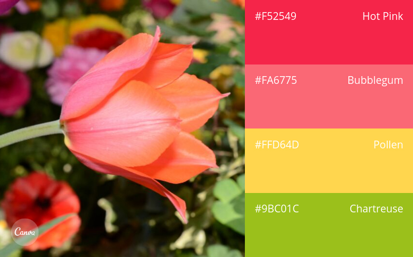
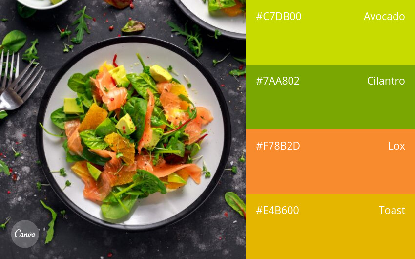
11. Fresh & Energetic
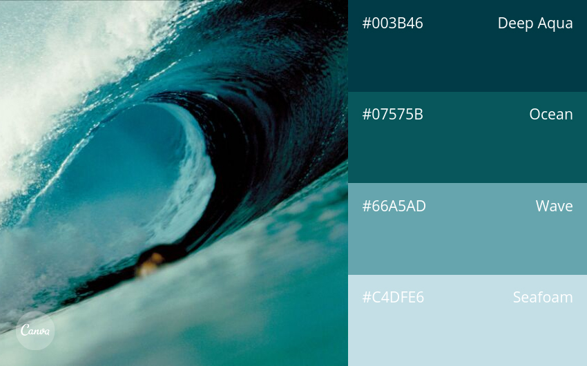
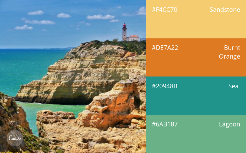
12. Surf & Turf
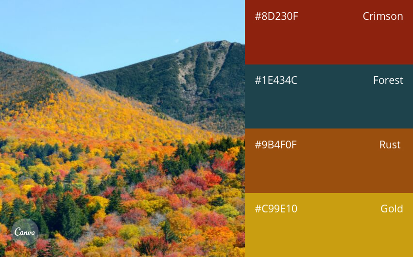
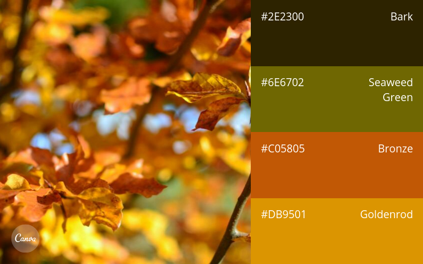
13. Autumn in Vermont
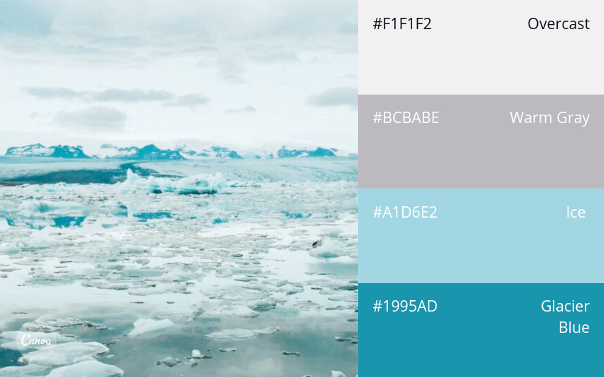
14. Icy Blues and Grays
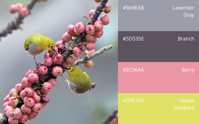
15. Birds & Berries
16. Day & Night
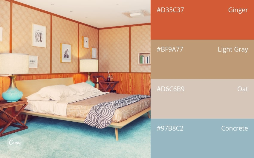
17. Stylish & Retro
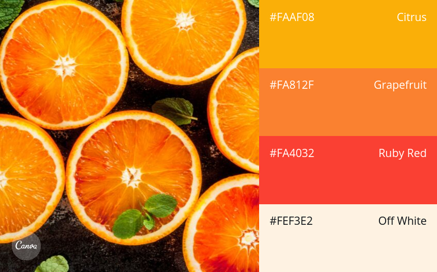
18. Shades of Citrus
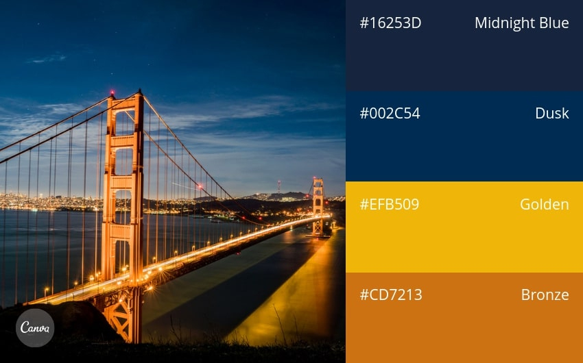
19. Sunset to Dusk
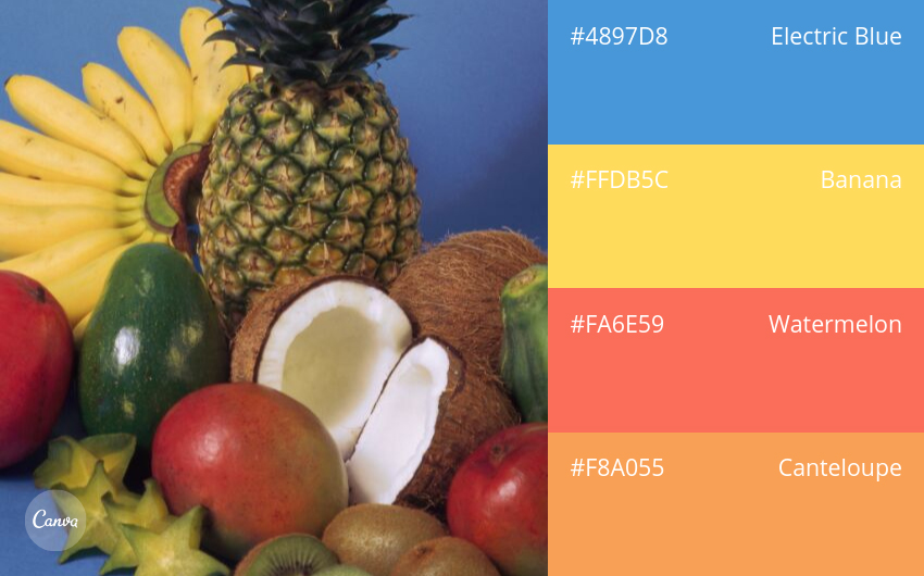
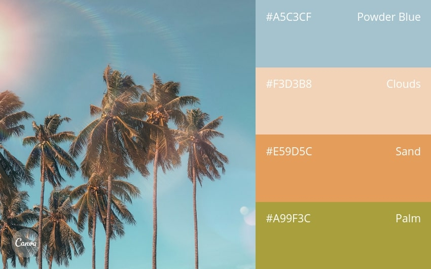
20. Bright & Tropical
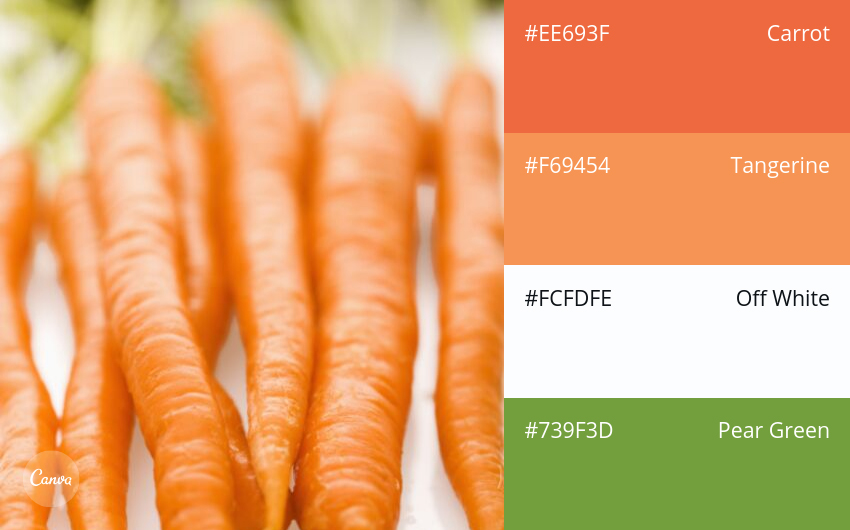
21. Warm Naturals
22. Bold Berries
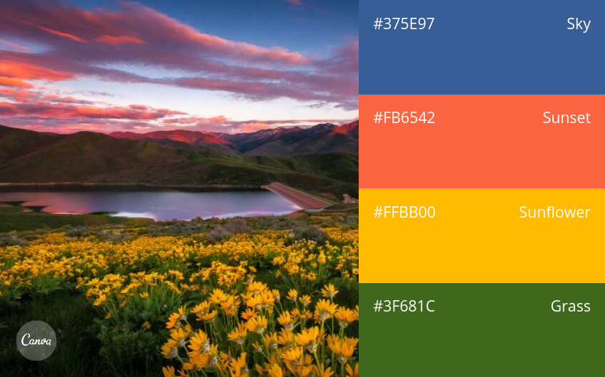
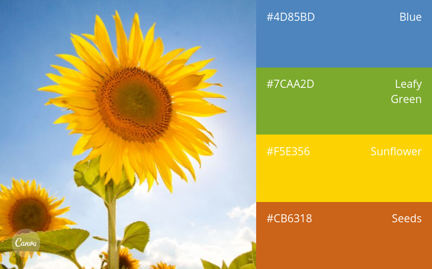
23. Summer Sunflower
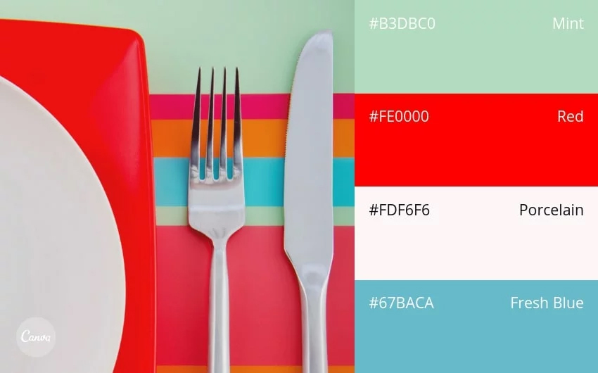
24. Modern & Crisp
25. Timeless & Nautical
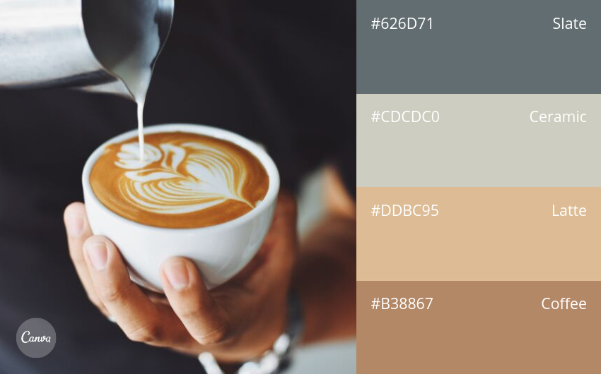
Food & Drink
26. Neutral & Versatile
27. Cheerful Brights
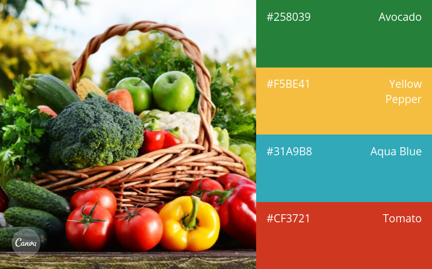
28. Garden Fresh
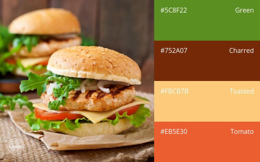
29. Summer Barbeque
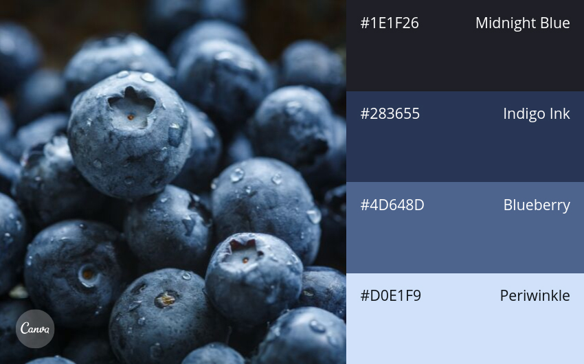
30. Berry Blues
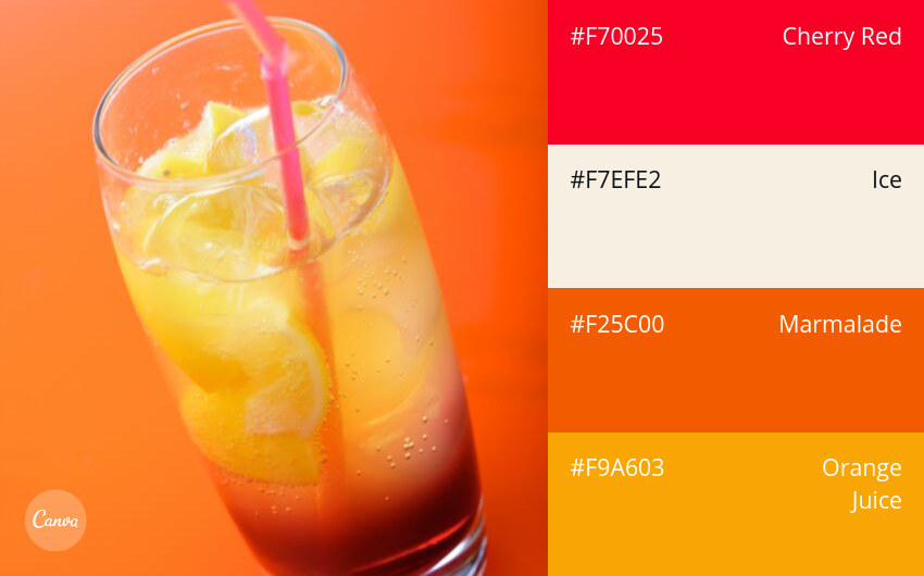
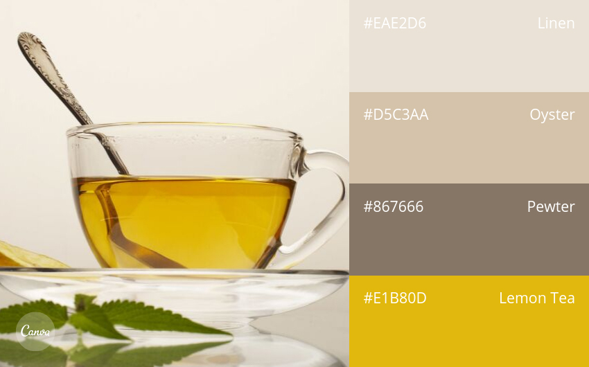
31. Lemonade Stand
32. Serene & Spa-Like

33. Fun & Tropical
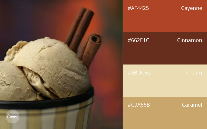
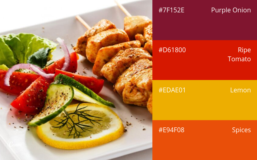
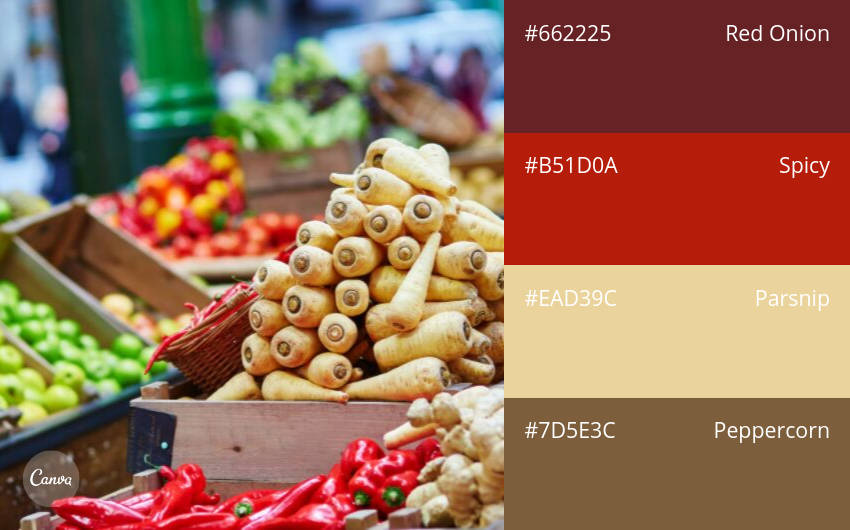
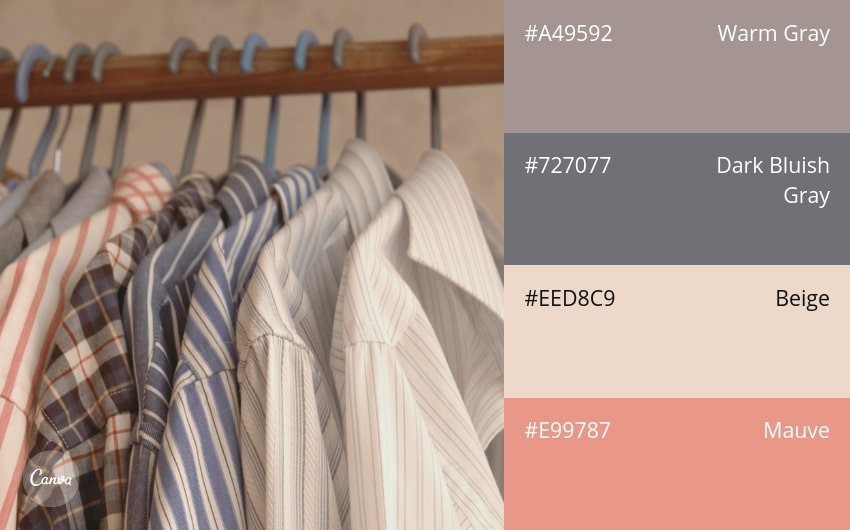
34. Spicy Neutrals
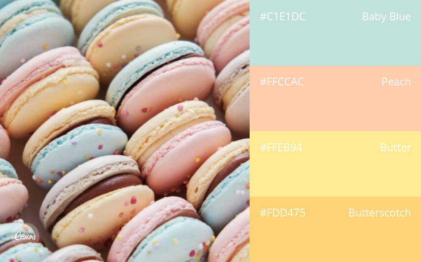
35. Pastels
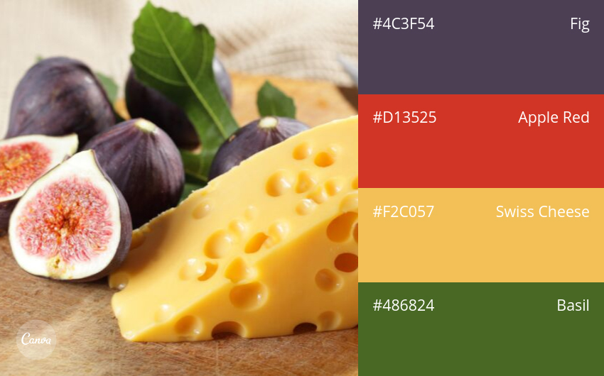
36. Bold & Cultured
37. Sunny Citrus
38. Crisp Complementary Colors
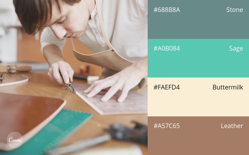
39. Warm & Rustic
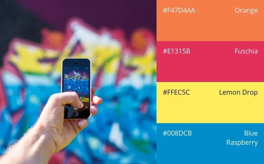
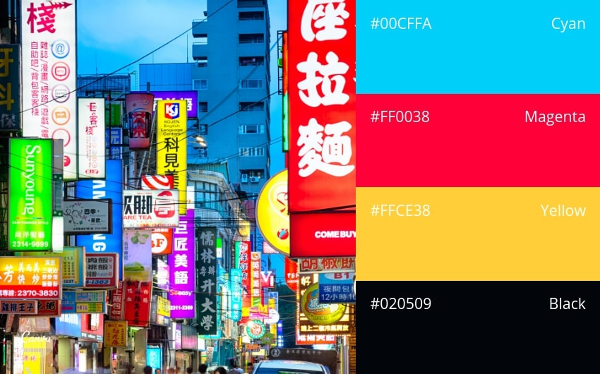
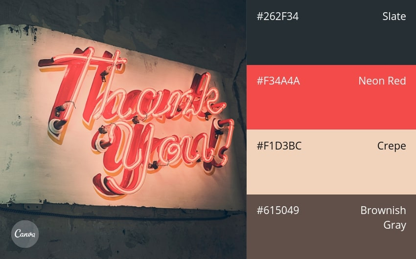
40. Neon Night
41. Jewel Tones
42. Polished & Inviting
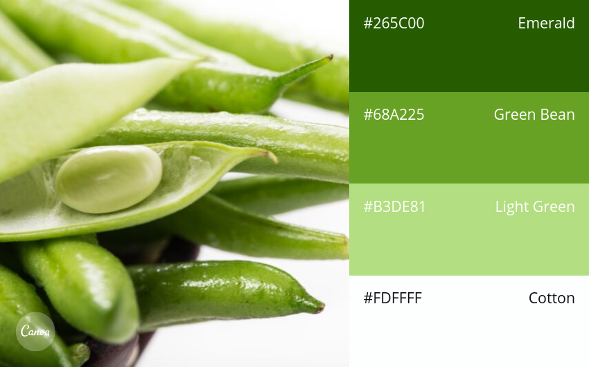
43. Fresh Greens
44. Wintery Reds
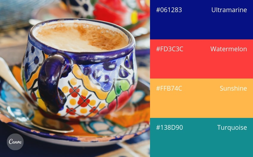
45. Summer Fiesta
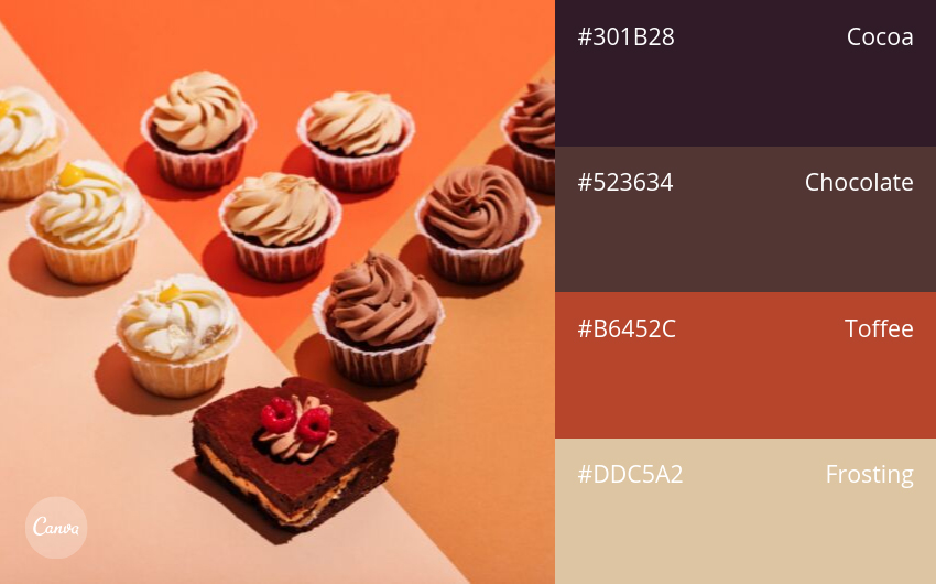
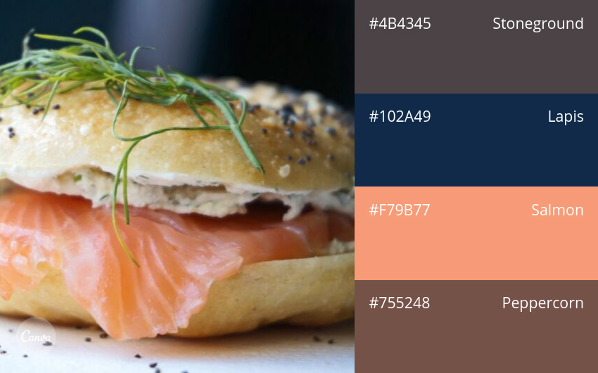
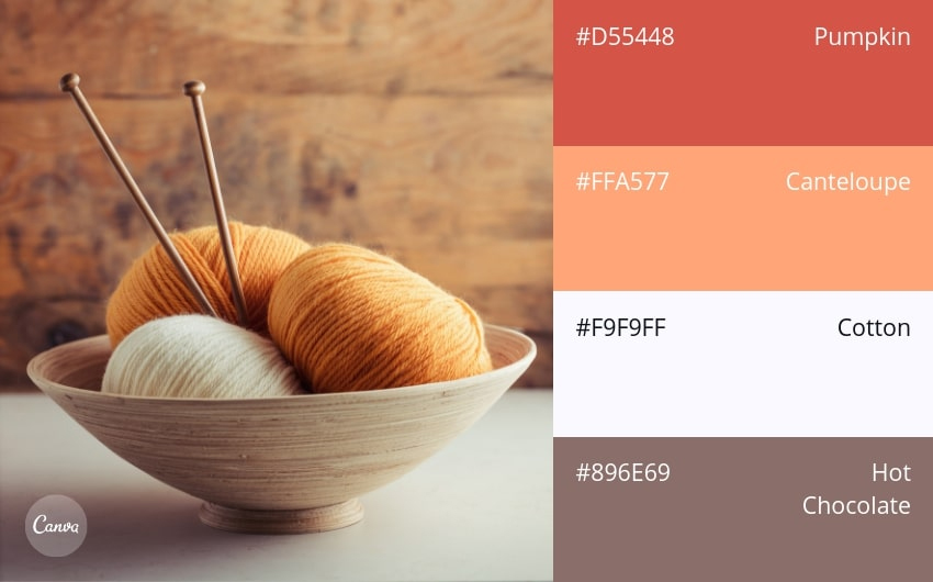
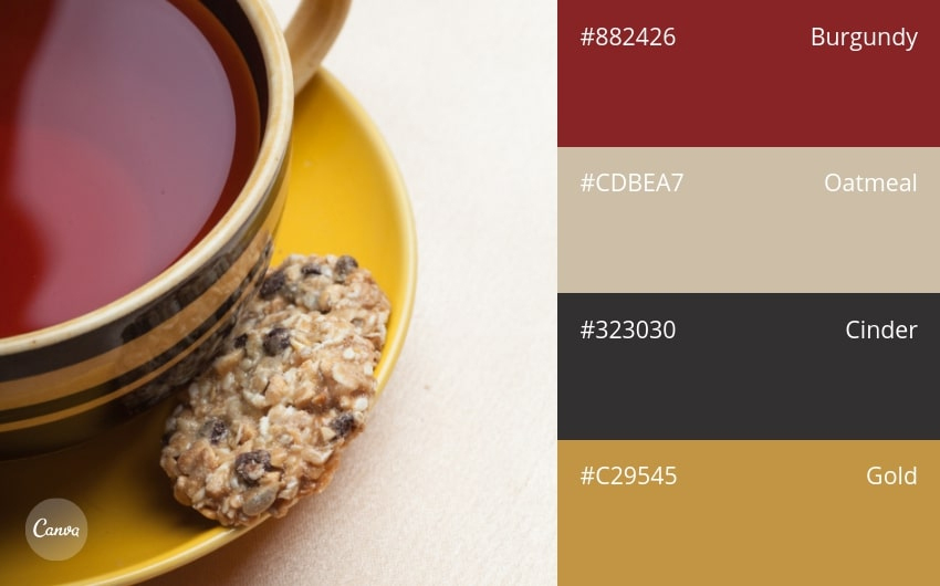
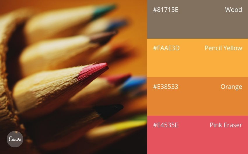
46. Chocolaty Browns
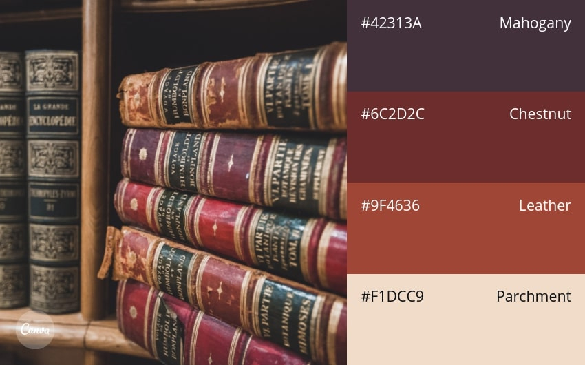
47. Naturally Elegant
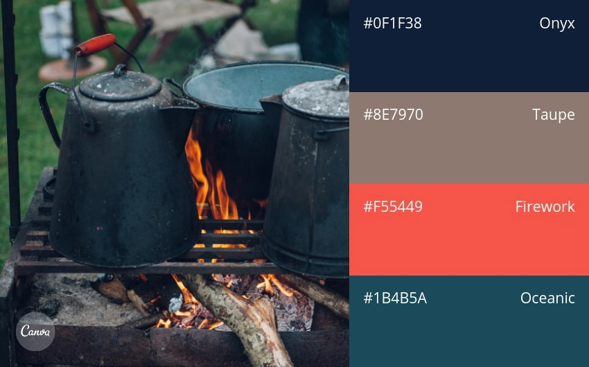
48. Cozy & Warm
49. Violet Sunset
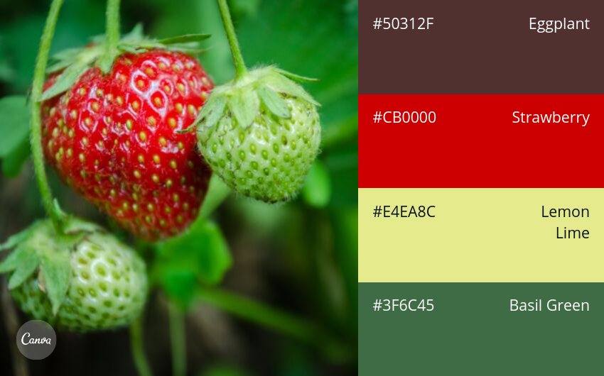
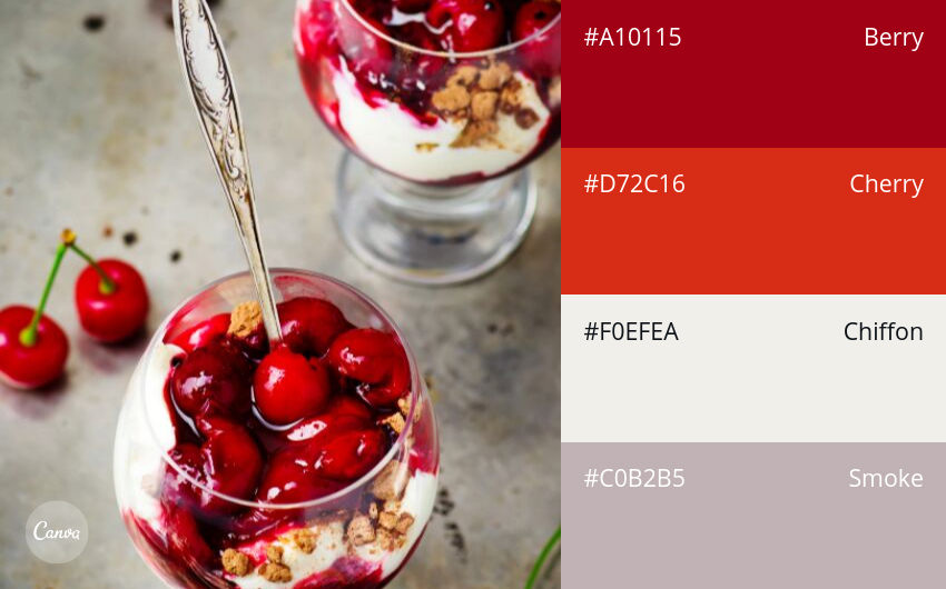
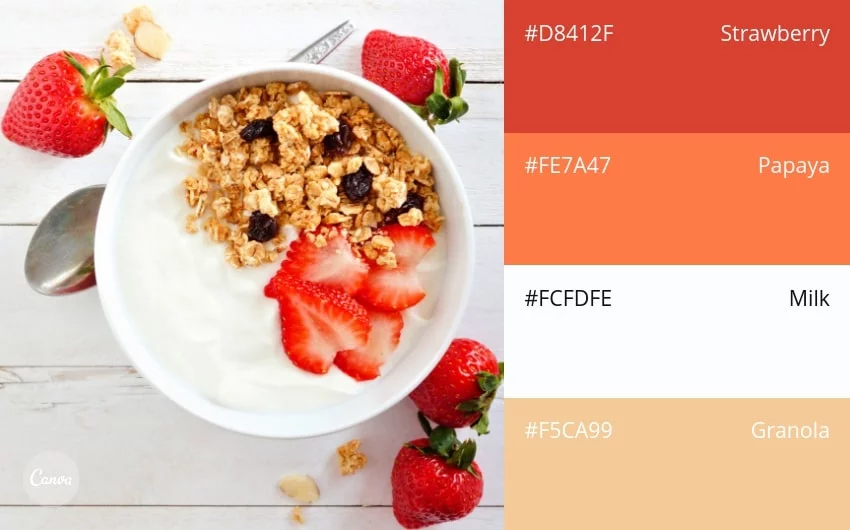
50. Strawberries & Cream
Travel
51. Grecian Holiday
52. Bold & Basic
53. Vineyard Neutrals
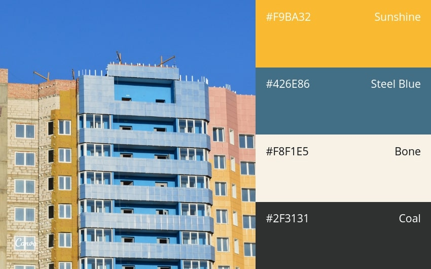
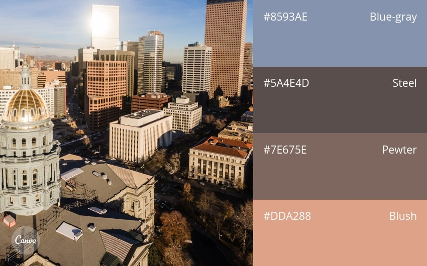
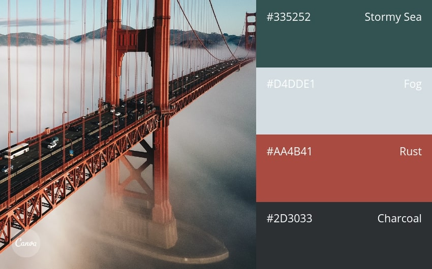
54. Modern & Urban
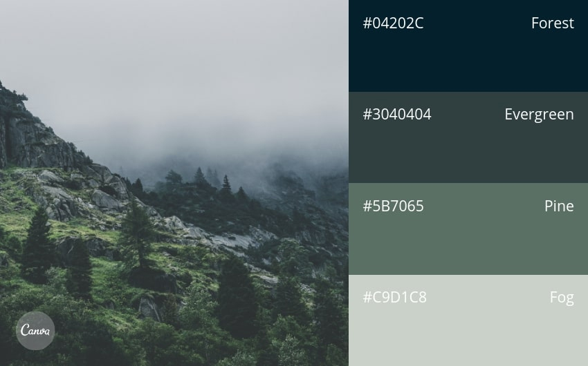
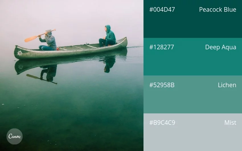
55. Misty Greens
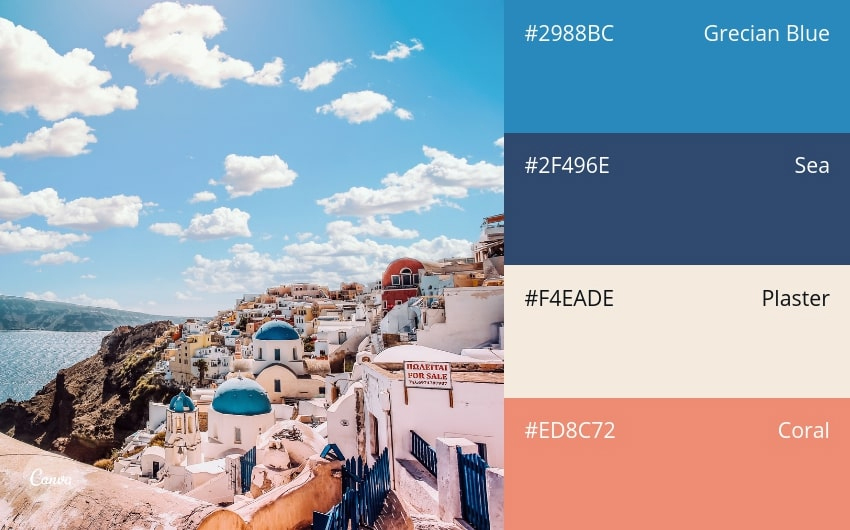
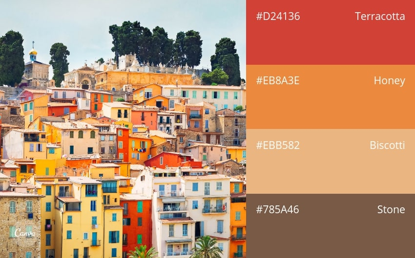
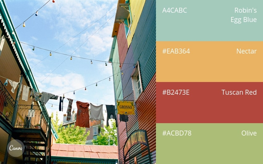
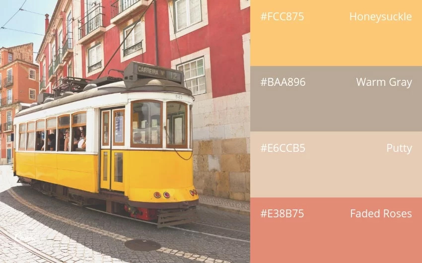
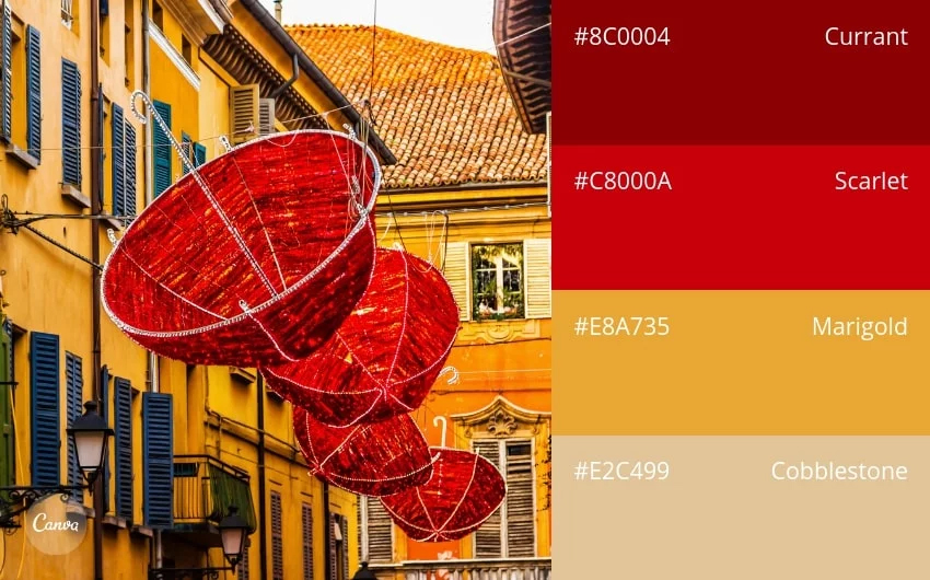
56. Sunkissed Village
57. Sun & Sky
58. Aqua Blues
59. Urban Oasis

60. Candy-Coated Brights
61. Muted & Antique
62. Classy & Timeless
63. Cosmopolitan
64. Cheerful & Friendly
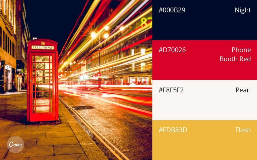
65. Nightlife
66. Coastal
67. Maritime Brights

68. Vintage Charm
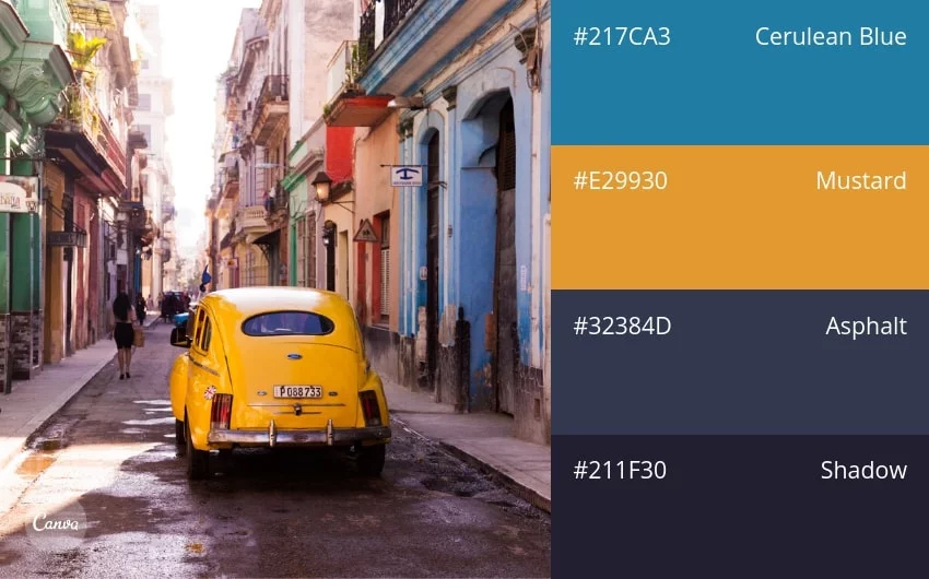
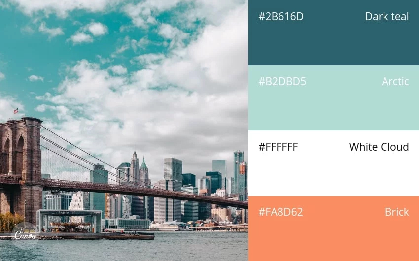
69. Understated & Versatile
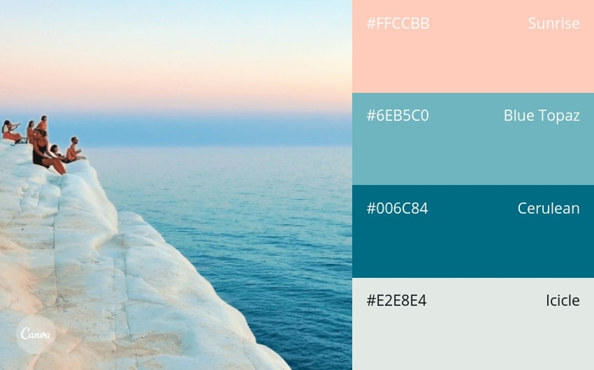
70. Arctic Sunrise
71. Mediterranean Afternoon
72. Hazy Grays
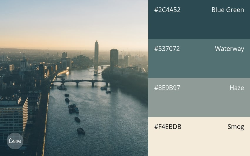
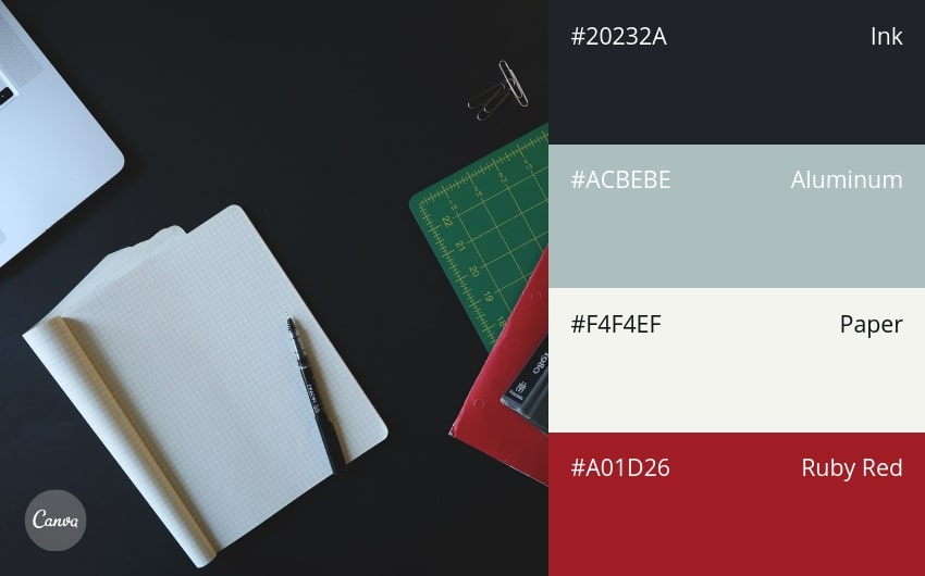
73. City Sights
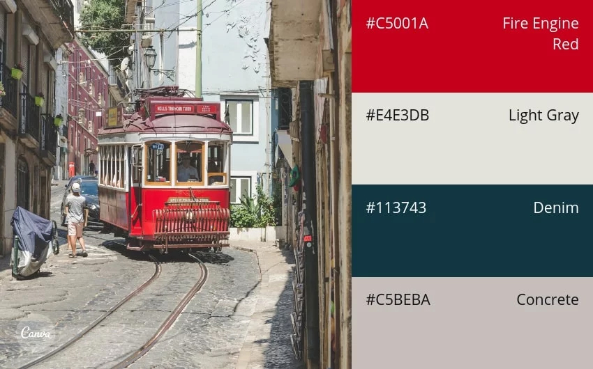
74. Retro & Relaxing
75. Green Fields
Everyday Items
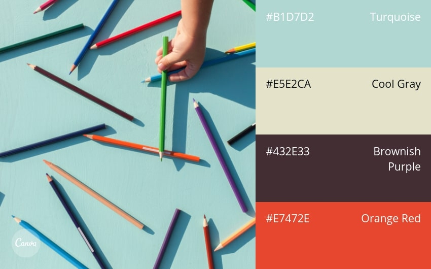
76. Distinctive & Unexpected
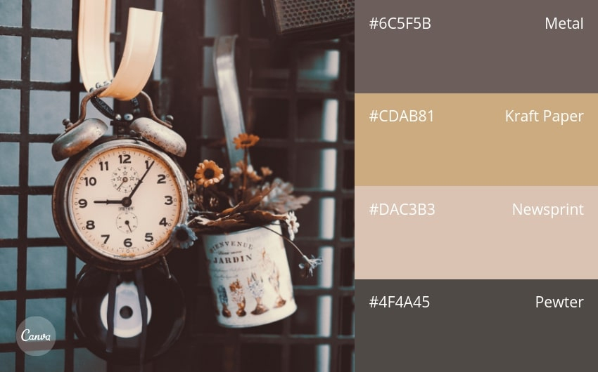
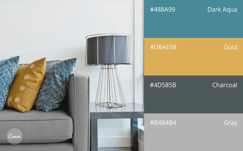
77. Sleek & Modern
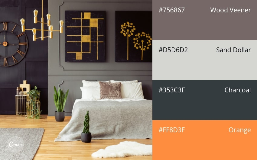
78. Orange Accent
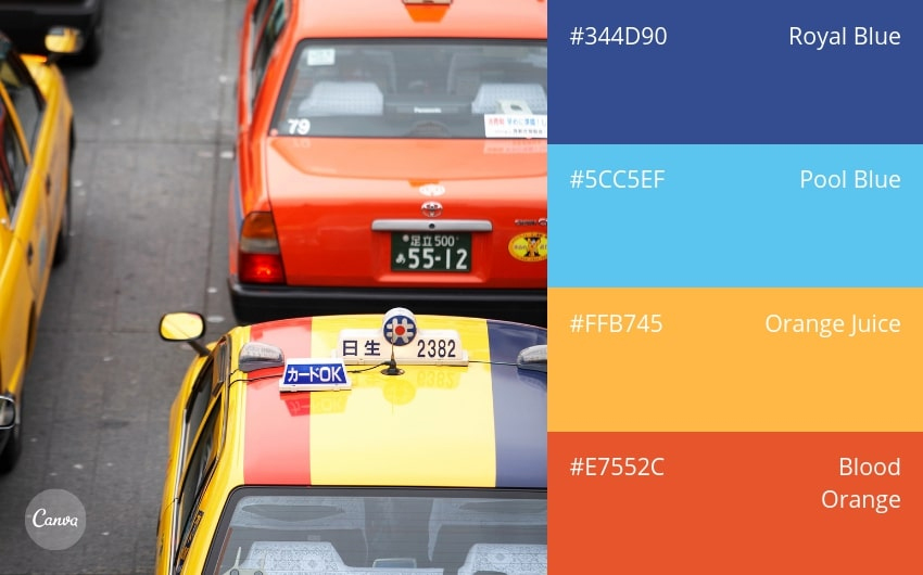
79. Beyond Black & White
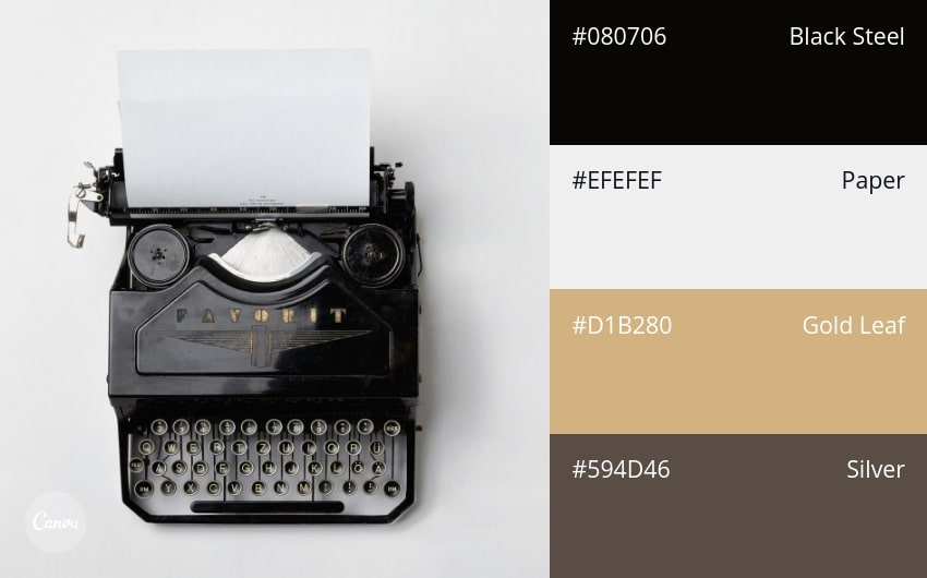
80. Shabby Chic Neutrals
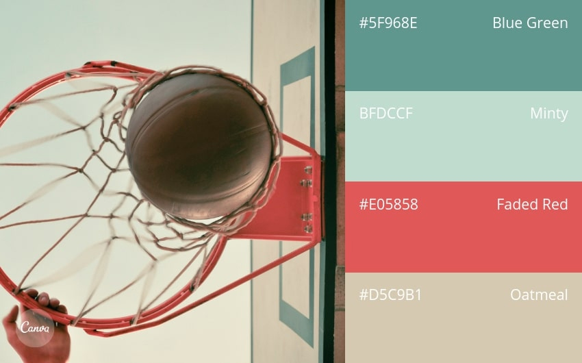
81. Warm & Cool

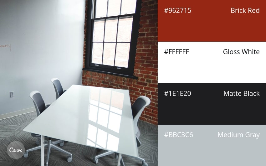
82. Industrial and In-Control
83. Autumn Oranges + Complementary Neutrals
84. Pool Party
85. Classic Metallics
86. Subtle & Versatile
87. Professional & Traditional
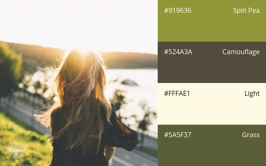
88. Light & Natural
89. Shadowy & Dramatic
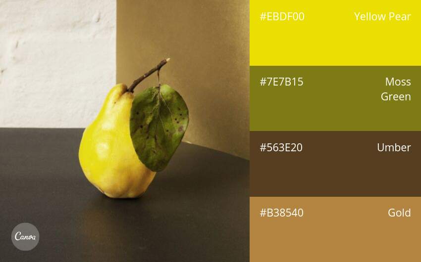
90. Golden Afternoon
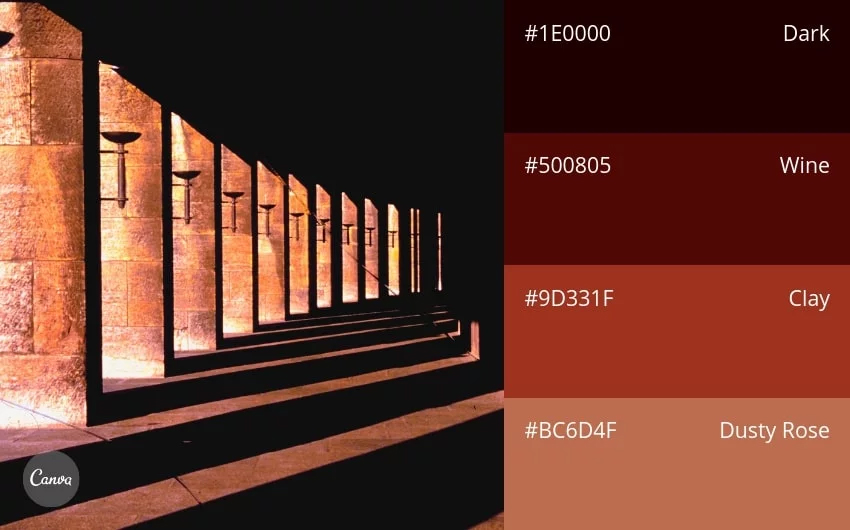
91. Dark & Handsome
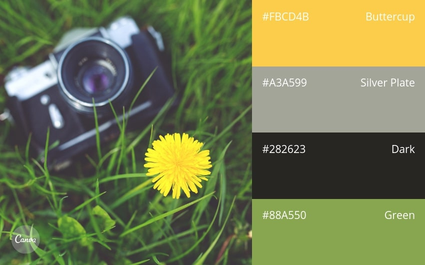
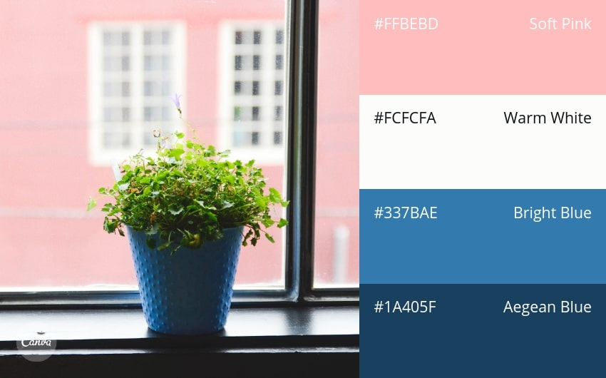
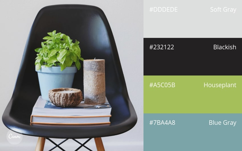
92. Technology Meets Nature
93. Cheerful Blues + Pink
94. Exotic & High-Impact
95. Back to School
96. Bright & Painterly
97. Urban Living
98. 1950s Kitchen
99. Smoky Purples
100. Trendy & Metropolitan
Credit จาก designschool.canva.com ที่เป็นแหล่งรวมบทความสำหรับการออกแบบสื่อที่ดีเยี่ยมครับ